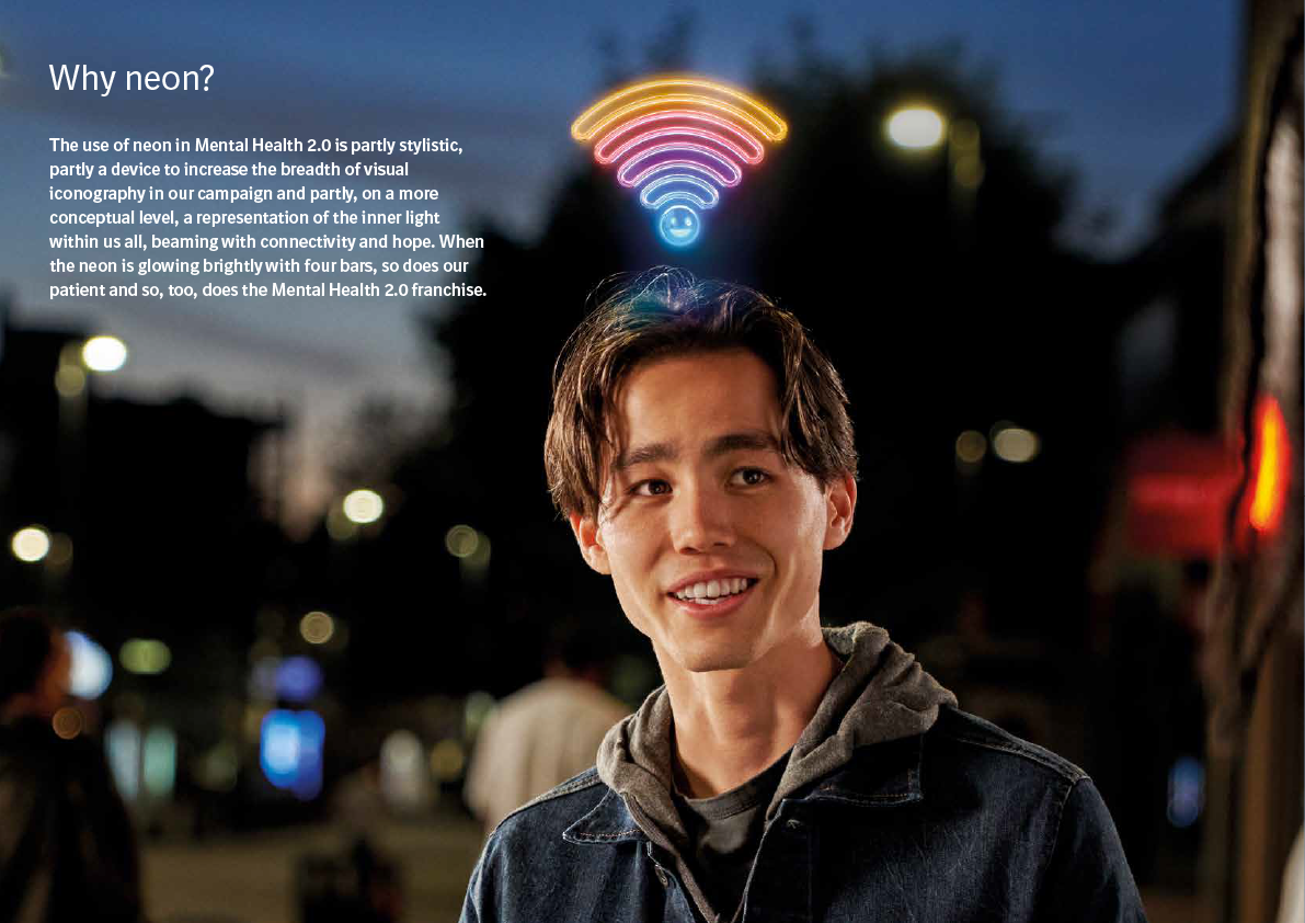
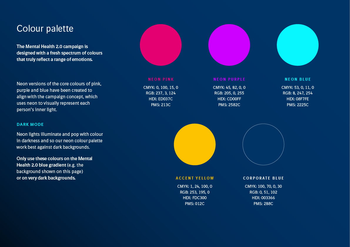
I was given pre-established brand guidelines outlining fonts, colours and usage of a stylised wifi symbol as a metaphor for connectivity:
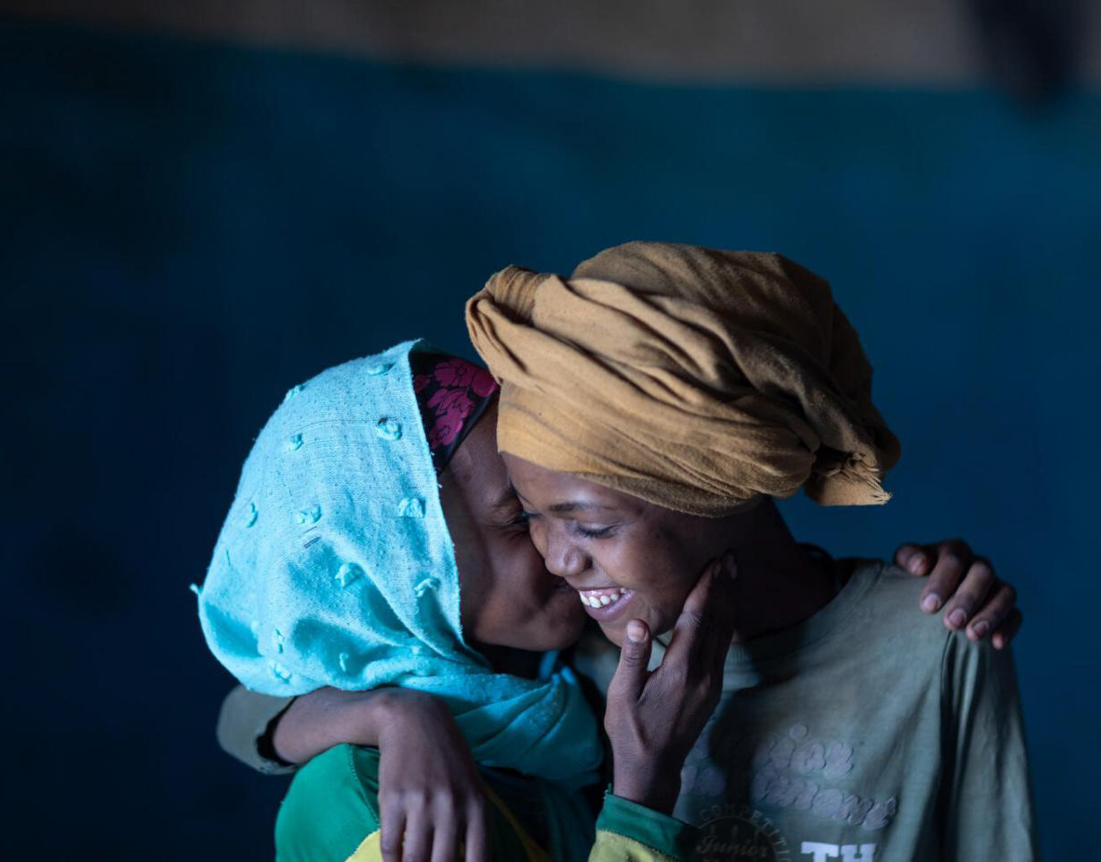
In the absence of a film shoot budget, stock footage clips are instead used throughout of event location, industry and patients.
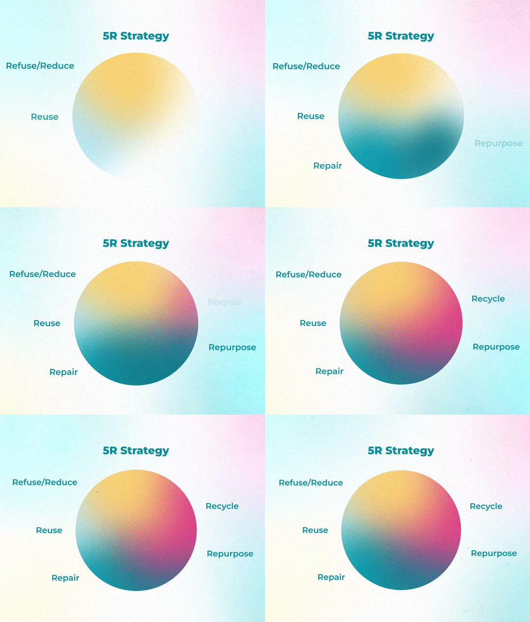
To help add variety I framed some of these in circles with animated ripples I created in keeping with the established brand guidelines, along with key words from the voice-over to help reinforce the narrative:
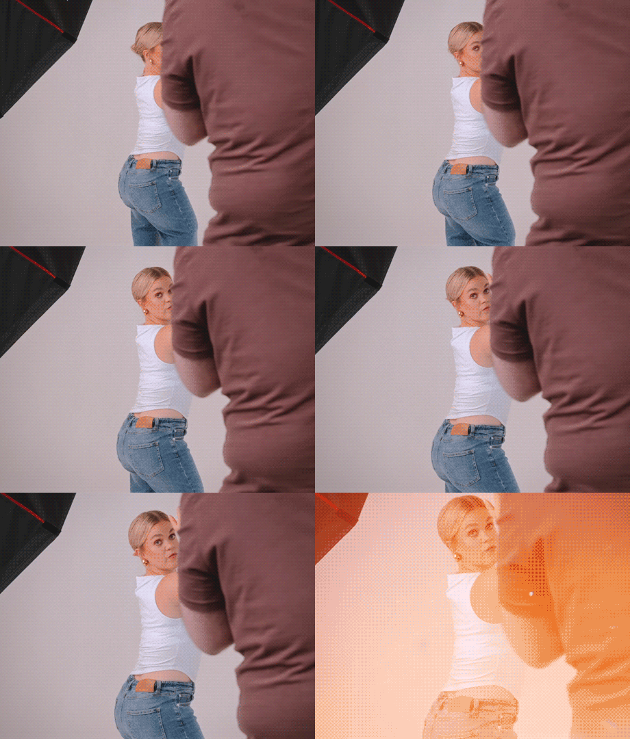
A branding requirement is for the wifi symbol to be attached to patients' heads to represent their emotional state. To achieve this in video it's a simple procedure to motion-track faces and attach the icon:
Not all event openers need to be bombastic, this gently settled the audience into what followed over the next few days using a few simple, cost-effective techniques.


